

In case you missed it, earlier this year we released an updated brand identity for our company, which includes a new logo and new visual branding elements. And, if you’re reading this blog, you’ve already seen one of the biggest pieces of our updated brand—this website. Soon you will begin to see our new look in all the places you see iN2L—on our social media accounts, at industry conferences, and even in some places in our product.
We believe our new look does a good job of respecting the business we’ve built over the last 20 years providing person-centered engagement to older adults. And we think it helps us reflect where we are going—forward on a path of continued evolution and innovation in how we serve senior living communities and elders.
Since our founding in 1999, we’ve used a logo that has been largely unchanged, with some minor updates every few years. But, our company has been changing. We’re growing, and as more senior living communities are considering our solution a must-have component of their resident experience, we are working as an organization to ensure we continue to meet the needs of the market and set the pace for what an optimal solution looks like.
Technology (in all its forms) has changed rapidly over the last 20 years and will continue to do so. Our legacy look was rooted heavily in this idea of technology. And, while we do leverage touch screen technology systems to deliver our solution, what really sets us apart is our focus on content. And how we thoughtfully and rigorously develop and curate that content so that elders and the caregivers who serve them can easily find ways to connect with each other and with what interests them to create meaningful, fun, and empowering engagement.
So, the goal for our new logo was to better reflect how we help create these engaging experiences for elders. And while we were at it, we decided to choose for our go-forward company name the abbreviated form of It’s Never 2 Late: iN2L. This is how most of our customers refer to us, and we like its simplicity.
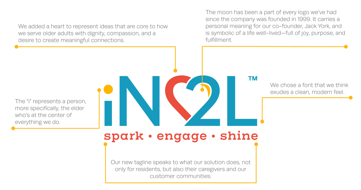
As you can see, we had some very specific reasons for choosing the elements of the logo. The “i” represents a person—the elder. We carried over the moon from our previous logos, and it stands for fullness of life. And in addition to serving as a natural other half to the 2, the heart is symbolic of dignity, compassion, and meaningful connection. Lastly, we just wanted to freshen things up a bit, so we chose bright and cheerful colors and a more streamlined, modern font.
We hope you like iN2L’s new logo and visual brand! Keep an eye out to see it continue to pop up in more places as we integrate it into all our public-facing materials. For more information about our refreshed branding, click here.
